Working toward my best
I am an amateur who has always loved art, but when I told my parents I wanted to major in art, after a lengthy silence, my mom simply said, “But you like to eat.” So I majored in the sciences. Great career, but sure missed the Art.
But now, many decades later, the Old Masters Academy is a dream come true – the courses I couldn’t take when younger are now readily available whenever I am ready to learn. And they are worth watching repeatedly!
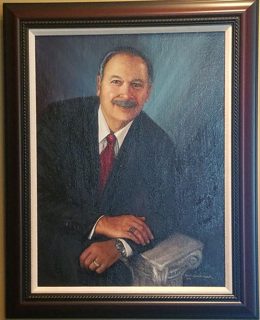
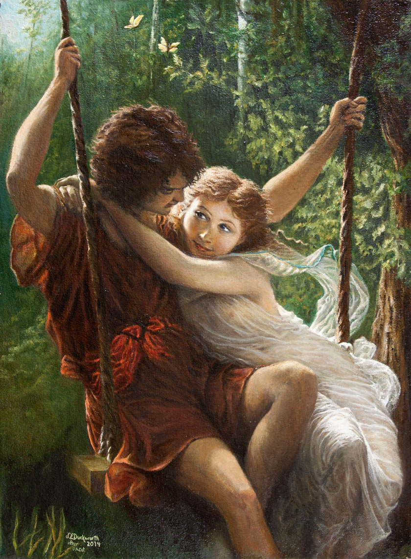
Before I took the course, I copied a masterpiece by Pierre August Cot. But after the course, I got brave enough to try a portrait of my husband. I know I have much to learn and that is the journey toward my best that I am enjoying with the help of the Old Masters Academy.

Great work, I love both.
I love them both. Great hands! Lovely relaxed pose in your portrait of your husband. Why not try the Pierre August Cot again just to see the improvement on a direct comparison?
Hi Linda,
I agree with Anet and Stephen and like them both, you did a great work !
Truly amazing.l wish l can do like that but still desire to enroll in old masters academy someday.
Linda,
I love all of your art work! Congratulations.
Excellent paintings, but personally I relater to the two young lovers. I love the emotion and seductive poses and the movement and spontaneous composition. I think your colors work beautifully to emphasize the playful mood of picture. You have reason to be very proud of yourself. Brilliant!
I gree, the painting of the youngens are just beautiful. A lot of feelings shown in this painting
Great works !!!!
Incredible paintings, both. You have captured feeliongs and personality, true works of art. I personally would like to see some of your earlier works to see how much improvement you have accomplished. I’m going to enroll my daughter and want to show her how much she could improve if she applies herself.
P.S. I’ve been trying portraits and they’re freaking HARD! (haven’t taken course yet myself)
Zeer bijzonder, wat n prachtige kunstwerken. Sinds kort ben ik begonnen met de prachtige volledige cursus.
The first one looks better than the portrait of the husband, even if the 1st is a copy. The girl’s face is alive, very beautiful. The hands of the husband are very good, maybe the best part of the painting because the body (unless he is a body builder) is quite big. I don’t know, maybe it is the photo of the painting that lacks quality.
I forgot to say that there is too much empty space on the right of the painting, there is nothing happening there. I hope that I am not too critical, but that is how I like people to critic my work, whatever they see and think it is not right I want to know for me to improve. Of course they (I) are not always right, but it is good to hear what the viewer thinks and feels.
Keep up the good work, it is quality.
well done You can be very pleased with your results I too am learning through the’ Paint like the Old Masters Academy” course.
You definitely “knew” your gift as a young girl. It’s wonderful you pursued it as an adult. It’s so encouraging to know lessons from the Academy brought out your beautiful paintings!
Portrait is good but the pose is a little stiff and maybe off a little in proportions of right and left side. Major improvement would be to tone down the light blue on the right side so the face would stand out more – like Rembrandt does with many of his portraits. That would also recreate some mystery which for me is one of the most important features of a masterpiece and is one of the great successes of Rembrandt.
The technical aspects of painting you already had. The portrait itself is good, if a little flat – did you use a photo to paint from?
Whats incorrect is your lack of adherence to the Golden Section. The figure needs to be shifted to the left to take advantage of the left side axis, and the hands need to be placed higher up, to match the bottom axis. Then, your choice of empty space will balance the figure. I would also recommend making the background out of a mix of burnt umber and ultramarine blue, so it stops competing eith the skin tone values.
Wow! I think both paintings are amazing. You keep painting as you have a fantastic talent.